A guide to understanding and testing with screen readers
Screen Readers and You
Screen readers can be daunting, both to design for and to use. After all, they take visual internet content and convert it into a format that can feel alien to first-time users. They certainly have a learning curve. However, it’s necessary to learn about this assistive technology to prevent a visually beautiful web page from becoming a nightmare to navigate. But have no fear—this comprehensive guide will help you understand and test with screen readers so that you’re ready to make the web accessible for everyone.
Understanding screen readers
What are they?
In short, a screen reader is an assistive technology that converts the visual content of a web page to braille or, most commonly, audio. They also enable special keyboard or gestural commands to replace mouse functionality and allow the selection of non-interactable elements on the page. There are just a few major ones, listed below in order of popularity according to the 2021 WebAIM screen reader survey:
- JAWS - Commercial for Windows desktop devices
- NVDA - Free for Windows desktop devices
- VoiceOver - Native to iOS desktop and mobile devices
- Narrator - Native to Windows desktop devices
- TalkBack - Native to Android mobile devices
While they all have their quirks, they all work fundamentally the same way in the browser: by programmatically reading the DOM (which is generated from the developer-written HTML) of the current webpage. As screen readers expect the DOM they read to follow best practices, any web application that does so will naturally have better accessibility; in other words, a web application being well-built goes hand in hand with it being accessible. In fact, if an application is not screen reader-accessible on a basic level, that’s a huge red flag for its implementation.
Who uses them?
So, who actually uses screen readers? The obvious answer is users with some degree of visual impairment, which is true; they form the majority of screen reader users and are a sizable user base of their own. The International Agency for the Prevention of Blindness puts the number of people worldwide with moderate-to-severe vision loss or total blindness at over 200 million. But that’s not even the whole picture. In fact, screen readers benefit users in a diverse array of other situations as well, including:
- A user with eye fatigue or migraines listening to a web page rather than reading it
- A user who has English as a second language and speaks it better than they read it
- A user with a cognitive disability such as aphasia, dyslexia, or autism who struggles with reading
- A user who’s multi-tasking, such as by taking notes as they listen to an article
- A user using a digital assistant such as Siri or Alexa to engage with web content
The number of users who benefit from screen reader accessibility is even higher. Half of screen reader accessibility is actually keyboard accessibility, as visually impaired users are not able to use a mouse to navigate a web page. By developing for screen reader users, the following users, among many others, also benefit:
- A user with a motor disability such as a lost or damaged limb, multiple sclerosis, or arthritis
- A user with a temporary hand or arm injury on their dominant hand who cannot precisely control a mouse
- A user with wrist or hand pain from drawing, writing by hand, or typing frequently
- A power user who prefers the speed and efficiency of using the keyboard
- A user with a broken trackpad on their laptop
While representative numbers for screen reader usage can be hard to find, it’s clear that screen reader accessibility benefits many people from all walks of life. And with the increasing importance of digital applications and tools in our day-to-day lives, it’s important now more than ever that these users can independently accomplish any tasks they set out to do online.
How are they used?
On that note, in order to develop for and test with screen readers, it’s important to know how their users navigate with them. As mentioned earlier, screen readers programmatically read the DOM of a web page by moving their “cursor” along it; they process all content linearly. This is referred to as a screen reader’s “browse” mode. Columnated web pages and grids of content will both be flattened according to the order of the elements within the DOM. So, contrary to a traditional user who might first see a large splash image or article preview on entering a new web page, the first thing a screen reader user will hear is the website’s title within the header of the HTML document. If this isn’t set, or isn’t adequately descriptive, they may have no clue what tab they’re actually on, even if there’s a giant site name in the top left corner of the page.
Screen reader users do have a way to get their bearings, however, and it’s also the mechanism through which they can skim a document quickly despite the screen reader’s linearity. Screen readers compile an ordered list of all key elements on the page to browse through and sorts them into collections, most commonly headings, landmarks, links, tables, and form controls. This allows users to hop from like element to like element on a page, and then continue browsing from there.
According to the 2021 WebAIM screen reader survey, the vast majority of screen reader users will navigate by heading to find information on a page, and with the find tool of their browser if they know exactly what they’re looking for. This is why it’s so crucial that web pages have programmatic headings following a strict document structure as well as textual versions of all visual elements. Landmarks are another tool for assisting screen reader’s with the organization of a page, though they are often misused. They’re helpful for navigating to broad strokes of the web page such as the header, footer, navigation bars, main content, and supplementary sections. Skip links, which are the first focusable element on the page, are also used to go straight to the main content.
Notably, going from element to element to “skim” the page does mean that screen reader users can easily miss crucial context. While a traditional user can quickly glance to the left or right of a link to determine where it goes, a screen reader user would have to guess if a link titled “here” would have relevant information on either side of it and manually move the screen reader’s cursor accordingly. Not only does this slow them down, but it requires them to read through all of the links again to return to their previous position in the links overview.
Until now, we’ve been discussing screen readers in the context of their primary function, browse mode. This mode is solely for reading through the page, especially non-interactive elements. Their other mode, “focus” mode, allows the user to interact with elements like inputs within a form without triggering the many keyboard shortcuts native to browse mode. For instance, “h” in browse mode will skip to the next heading, while “h” in focus mode will allow a user to type out their name “Henry”. This mode is automatically activated for more complex elements by tabbing around the page, but simpler interactive elements like links, buttons, and checkboxes must have the mode manually enabled. Typically, a user will stay in focus mode for the entirety of filling out a form.
Why is this important? Well, this is another situation that can cause a screen reader user to lack context for a given interaction. A user will not be given headings, labels, tooltips, and other information in focus mode unless it is explicitly and programmatically linked to the input their screen reader’s cursor is currently focused on. And since forms are typically completed entirely in focus mode, a user may make it all the way through the form and not even be aware any information was there to browse for.
This is a lot of information, but just remember: screen reader users want to, and do, explore a web page just like any traditional user. They want an equivalent experience. It’s a web developer’s job to ensure they can do that intuitively and easily.
Testing with Screen Readers
So, why do we need to test our web applications with screen readers? Can’t developers just look through the code to spot any accessibility issues? Unfortunately, these problems can be difficult to catch by sight alone; often a single misplaced attribute can break the accessibility of an entire component. At the end of the day, screen readers are the easiest and most efficient way to debug applications for screen reader compatibility. We can’t truly emulate your standard screen reader user, since we already know what the page is supposed to look like, but we can certainly smooth over a lot of pain points and ensure the site is usable.
The first step of this process actually doesn’t require a screen reader at all; remember, half of screen reader accessibility is keyboard accessibility, so it only makes sense to do some keyboard-only testing. All this requires is to navigate to the page you’re testing, click the address bar, and then not touch your mouse again while attempting to accomplish all tasks on the page. You should be able to navigate to and away from every interactable element on the page in a logical order, visually see where you are focused at all times, and trigger all possible mouse functionality (ex. tooltips on hover), with the keyboard alone.
Use tab to move focus forward, shift+tab to move focus back, space or enter to activate the currently focused element, and arrow keys to select from dropdowns, radio buttons, menu bars, and other elements. To know which arrow keys to use for a given element, or whether space or enter should work, find the most closely related element in the ARIA Authoring Practices Guide’s web patterns guide and see its listed keyboard interactions.
Note that this isn’t enabled on Mac or Safari by default and can be toggled at System Preferences > Keyboard > Shortcuts > Use keyboard navigation to move focus between controls and Safari Preferences > Advanced > Accessibility > Press Tab to highlight each item on a webpage, respectively.
Now onto the next phase of the process: actually using a screen reader.
Which screen reader should I choose?
The best screen reader to start with is always going to be the screen reader that is easiest to access for you. For that reason, this tutorial will be using VoiceOver, iOS’s native screen reader. However, while commands differ between screen readers, functionality remains roughly the same. Deque university provides screen reader commands and guidance for all of the major screen readers, which is a great reference to have open while testing.
Each screen reader has a recommended browser pairing, though they all will work cross-browser for most functionality. Notably, screen readers don’t have a standardized output, so it’s difficult to predict exactly how a given web page will sound to a screen reader user. That’s alright—so long as the HTML best practices are followed, it shouldn’t be a problem. Here are the most popular screen readers and their ideal browser:
- JAWS - Chrome
- NVDA - Firefox
- VoiceOver - Safari
- Narrator - Edge
Although it’s best to test with as many screen reader and browser combinations as possible, to start, we’ll test with the most available screen reader for the frontend team (VoiceOver) and the most used browser (Chrome).
How do I use a screen reader?
As for actually operating a screen reader, luckily, VoiceOver has a great screen reader tutorial to ease you in. It’s located at System Preferences → Accessibility → VoiceOver. It’s important to note that all VoiceOver commands start with VO, which is by default the caps lock key or the control+option keys pressed together.
To get started, press command+F5 or enable VoiceOver from System Preferences. It can be disabled the same way. Note that the screen reader also prints the text it says on the screen; if the robotic voice gives you trouble, this is a handy window to keep an eye on. It can also be expanded by clicking and dragging at its edges.
Navigate to your web page with a mouse, click the address bar, and then let go. Refresh the page with command+R and you should be good to start testing. But first, some basic controls.
The most useful command when first arriving on a web page is VO+U, which opens the VoiceOver rotor. This allows you to navigate each page by links, headings, landmarks, form controls, and so on, and is a great way to skim the page. However, you can also read the whole page top-to-bottom with VO+A (stop with control); this can be helpful to ensure all content is read in a logical order. You can go through the page line by line with VO+right/left arrow key. To adjust the speech settings at any time, you can press VO+command+right/left arrow key and then VO+command+up/down arrow key when presented with your options. See this Deque University page for more keyboard shortcuts, but these basics, alongside the standard keyboard navigation controls, are enough to test everything you need to. The screen reader will also prompt you for certain commands when necessary.
For the most part, you can use the screen reader and look at the page simultaneously as you test, but if you want to be really thorough, you can turn down the brightness on Macs all the way to 0, which turns off the screen. This can be useful for a final pass-through, but otherwise it’s best to be able to spot any inconsistencies between the screen reader output and the visual webpage.
What should I watch for when testing?
Follow the checklist at the bottom of this guide for a step-by-step walkthrough, but here’s some more detailed commentary on the key areas you’ll come across while testing.
💻 Developer notes: Throughout this section, relevant developmental details will be added in these blockquotes for additional context. This guide does not provide a comprehensive overview of best practices and solutions for accessibility issues; for further reading, please see the MDN Web Docs’ accessibility guidelines, the Web Accessibility Initiative’s accessibility principles, and the ARIA Authoring Practices Guide.
Page organization
In order to keep screen reader and traditional users’ experiences equivalent, the content presented by the screen reader should always follow the visual order of the page. If the visual order isn’t linear, the screen reader output should still be organized logically and as closely to the expected order a traditional user will read the page as possible. This is most easily tested by navigating line by line (VO+right/left arrow key) or reading the entire page aloud (VO+A).
Headings and landmarks should be paid close attention to. There should only be a single “Heading Level 1”, and it should roughly match the title of the web page you hear immediately upon a refresh. Both should describe the page as a whole rather than a specific section. All other headings can be as numerous or few as needed to convey the content of the web page, but there should never be a skipped level or it becomes unclear which heading is a subheading of another. Don’t worry about their comparative sizes on the screen (though it’s best if the design follows the intended logical order); think of headings purely as a document outline or table of contents, and screen reader users will thank you. For landmarks, it’s sufficient to simply ensure that they appear within the landmarks menu and that any duplicates (such as two navigation landmarks) are labeled appropriately. Headings and landmarks can be navigated through the VoiceOver rotor (VO+U).
Lastly, make a note of how long it takes you to get to the main content of the page. Additional page organization or a “skip to main” button may be necessary.
💻 Developer notes - headers and landmarks: Remember that screen readers work from the DOM; the HTML should be in the logical order of the page regardless of its visual styling. The same goes for headings; don’t pick your header level based on its default size. If having a single
<h1>that describes the page isn’t possible, one can always be hidden visually or have its text overridden witharia-label. Note that although more than one<h1>is allowed on a single page by the spec, in practice few screen readers know what to do with them. In addition, dynamic landmarks likesectionshould be given an explicit label; they won’t be announced by the screen reader otherwise.
💻 Developer notes - compatibility: As there’s a large number of screen readers and screen reader combinations a user could potentially be using, it’s important to keep an eye out for accessibility features that aren’t universal yet, like the
<article>landmark. Generally, features that relate to HTML guidelines prior to HTML5 are safe across all modern browser and screen reader combinations, so any features related to HTML5 semantic elements or other developments should also have a more basic fallback. For instance, using headers alongside landmarks will offer support to everyone and benefit traditional users as well. Accessibility Support is a great compilation of potential deviations between screen readers for reference.
Visual content
Pay close attention whenever you come across an image, icon, or typographical symbol. What is read aloud by the screen reader when you tab or ``VO+right/left arrow key` to that element? For all content-relevant elements, there should be a short, unbiased description without interpretation. A ton of detail isn’t necessary if the image is just proving a point; for instance, “Woman standing on the beach at sunset” is sufficient for a general travel article. For something like a product image, more detail might be warranted, and something like a chart should have a table of some kind to navigate. For elements that are purely decorative (ex. a fancy line divider), you should hear nothing at all.
Whether certain typographical symbols like "*" (commonly used to indicate a required field in forms) are read aloud depends on a user’s specific punctuation settings in the screen reader, so they can’t be relied on exclusively despite being plain text. If possible, it’s best to build in some redundancy for all users, as everyone will benefit from additional clarity. Although “*” indicating a required form field is the standard, not all users may understand that, or they may overlook the symbol. On the other hand, “(Required)” or “(Optional)” next to a form field is explicit and equally understandable to all users.
Finally, note whenever you can tab to an element that is not announced by the screen reader; with no visuals, this is highly confusing and a sign of incorrectly-implemented accessibility tools.
💻 Developer notes: Purely decorative images should have an empty “alt” or equivalent; otherwise, the screen reader will read out the file name. Note that there is a
requiredattribute that can be used for required form fields, but in other cases the instructional visual would have to be associated to a relevant interactive element witharia-labelledbyoraria-describedby. Finally,aria-hiddenshould never be used on focusable elements.
Clarity of purpose
Forms and other interactive elements make up the bulk of potential screen reader mishaps. When tabing from focusable element to focusable element on the page, pay attention to the screen reader’s output. All links, buttons, and form inputs should have descriptive labels that make sense in isolation from other content. Buttons should not just say “click me”, links should not just say “here”, and form inputs should describe the content and format of their desired values. While what’s displayed on screen and what the screen reader outputs can differ, they should both convey an equivalent meaning. However, it does benefit all users for these descriptive labels to be visible.
Note that all supplementary information (ex. field group name, error messages) for that element should be read out as well; especially in a form, the user may not realize the information is available otherwise. The same goes for the current status of an element. If a button is visually disabled, the screen reader should say so, and if a form field is currently red, the screen reader should output “invalid”.
Tables also require some additional investigation. A screen reader should announce a table as a table as well as a brief description of its content. All tables should have both row and column headers unless the cell content is sufficiently self-descriptive, and those headers should be unique. When browsing individual cells, the row and column headers should both be announced prior to a cell’s content. One or the other may occasionally be silent depending on the table’s orientation, but switching to a different row or column should trigger its announcement again.
💻 Developer notes - forms: Inputs can take the
typeandautocompleteattributes to properly inform the user of the input’s desired format. Note that related inputs should almost always be grouped inside a<fieldset>and labeled with a<legend>; headers will not be read in focus mode and are not sufficient. Any longform description for an input or input group can be attached to the representative element witharia-describedby; reserve labels for brief descriptions of desired input content. Be wary if any elements within anaria-labelledbyoraria-describedbyhave thearia-hiddenattribute: they will not be hidden to the screen reader, which can be especially confusing for form error messages.
💻 Developer notes - interactive elements: Always use semantic HTML over generic elements when possible. Screen reader users base their expectations of an element’s purpose off of its
roleattribute anddisplayproperty, even for non-interactive elements. Note that ARIA attributes provide no implementation, and it must be re-implemented to the screen reader user’s expectations for a particular element. This is just one reason why “no ARIA is better than bad ARIA”; use it sparingly.
Content changes
Keep an eye out for client-side content changes after the initial full-page load. These include, but are by no means limited to:
- A custom loader completing
- An alert popping up on screen
- Errors appearing on an individual form input
- A form as a whole failing with a list of errors
- A search or filter completing
Essentially, if something changes on the screen, the screen reader should announce that change. However, that announcement should never interrupt the screen reader mid-sentence unless it’s a truly time-sensitive message, such as a time-out before a form is expired.
💻 Developer notes: There are two main ways to signify these changes to screen readers:
role=”alert”andaria-live=”polite”.aria-livealso has an “assertive” value, but it’s used implicitly byrole=”alert”regardless. “Alert” should only be used if necessary, as explained above. Note that aria-live=”assertive” will only work properly if only one error is triggered at a time; you can still use it for multiple errors, but another source of info that gives you all errors on the page is best.
Testing Bidx
Now for an example of everything we’ve discussed so far. I want to do a quick overview of screen reader accessibility in Bidx, so I decide to attempt a few workflows:
- Change phone number and company role
- Open and investigate agency picker
- Create a bid request
- Read users support data
However, first I have to navigate to Bidx UI. With my screen reader on (command+F5), I navigate to the account settings page, and notice something odd on refresh (command+R).
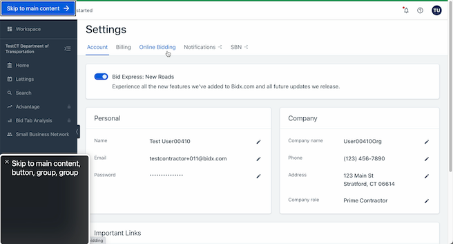
The screen reader doesn’t announce a page title. There’s other ways for me to get it, such as by switching to a different tab and back, but the lack of title could easily confuse me if I came back to the page after a coffee break. Having the “skip to main” button is very nice, though; without it, it would take me 16 presses of the tab key to reach the same point on the page. That would be a huge pain if I needed to accomplish any long-form task within the app.
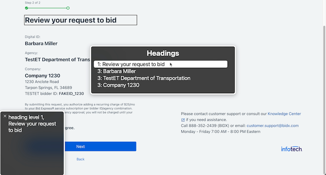
So, now I need to get my bearings. I can check the heading and landmark structure of the page with VO+U.
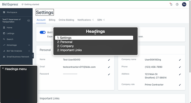
The headings all work well enough. I immediately know that I’m on the account settings view and what categories of my settings I can change here. As we’ll see later, though, starting the headings with “Settings” without the inclusion of “Bid Express” or an equivalent can cause some issues. In addition, it’s really best for the level 1 heading to match or nearly match the title of the page, which in this case is “Settings - Bid Express”.
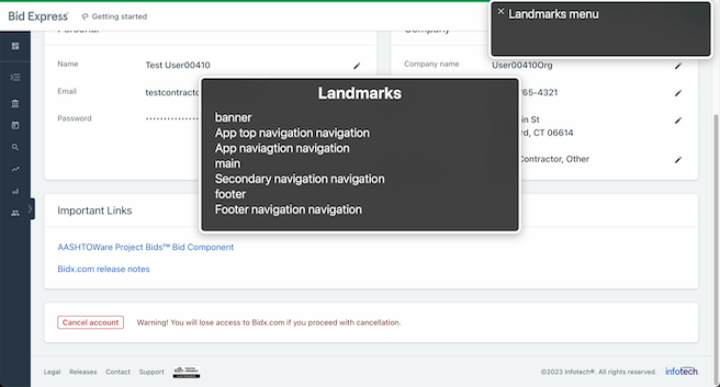
The landmarks are a little odd. They get me around the page if I select them, but I don’t know what “app top navigation” and “secondary navigation” are. Something like “Settings navigation”, for instance, would be much more descriptive and immediately understandable.
Regardless, now that I have my bearings, it’s time to try these short workflows.
Change phone number and company role
Phone number
I’m already on the account page, so no worries there. I can use my list of headings (VO+U) to quickly hop to the “Company” section of the page and make my way to the edit button for the phone number (VO+right arrow key). I could also just tab my way down the page; since the button is labeled “Edit phone”, it’s very easy to find!
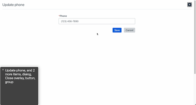
On opening the overlay, we have a problem...the tab button doesn’t work for navigation! I’m unable to get from the close button to the phone input without manually working my way down the page with the screen reader’s browsing tools or by using my mouse. It’s doable, but very confusing and much more complicated.

However, everything looks good on the input on click. I know from the screen reader’s announcement that this is a phone number, that it needs to be in telephone format, and that it’s required. It also says it’s invalid, which isn’t true, but a look in the dev tools reveals that this input has aria-invalid=”true” set when it shouldn’t be. This is one reason why screen readers are great; they provide a very easy way to spot this kind of bug!
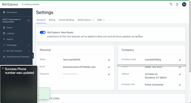
After I type in some new numbers, tab to the submit button, and press space, I’m taken back to the account settings view. The screen reader announces the success of the change, just as the toast in the bottom left corner of the page does for a sighted user. Very nice! Now for the company role.
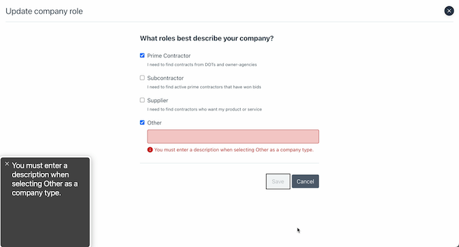
Company role
I’m already in the Company section, so I can easily enter the company role overlay view by tabbing to its “edit” button, again appropriately labeled as “edit company role”. It’s important to note that the company role overlay view is actually an entirely separate page, so the “edit” button being a button (for in-page actions) rather than a link (for between-page navigation) is confusing. However, sighted users are also given the impression that this is an overlay over the existing page, so in this case, it may be the right move in order to provide an equivalent experience for all users.

I use the headings list again (VO+U) to get my bearings, and unfortunately, the only heading on this page is a “Heading Level 2”. In this case, it should be a “Heading Level 1” in order to keep the hierarchical order of headings intact. For now, though, I move on towards the input controls with tab.
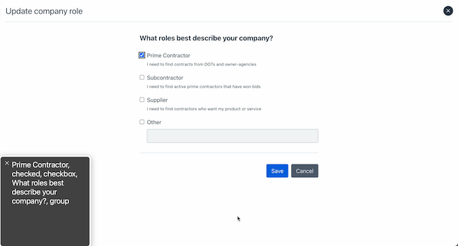
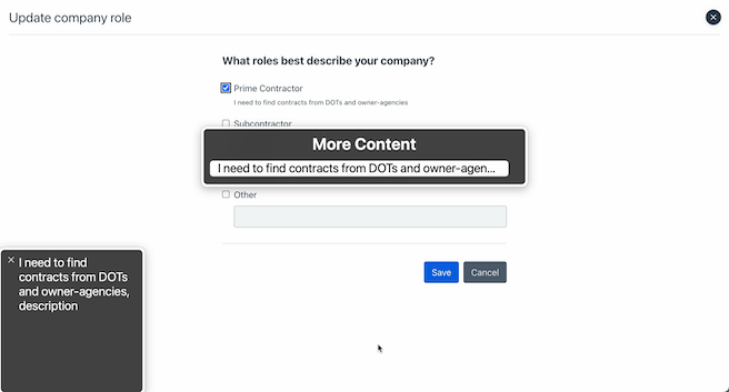
Focusing on the “Prime Contractor” checkbox also reads aloud the checkbox group prompt “What roles best describe your company?”, which is great. Especially in cases where the inputs just have “Yes” or “No”, a group label is absolutely necessary, or I’d have no idea what question I’m answering. I’m also given the current status of the checkbox, “checked”. I also have the option of hearing more about this “Prime Contractor” option and can listen to the helper text, "I need to find contracts from DOTs and owner-agencies", by following VoiceOver’s prompt. If that helper text hadn’t been correctly attached to the checkbox, I may not have known it was on the page at all.
I want to change my company type to “Other”, so I toggle off the currently selected checkbox with space and work my way down with tab. After checking “Other” with space, I try to submit, but I can’t find the submit button with tab. My screen reader’s cursor skips right over it.
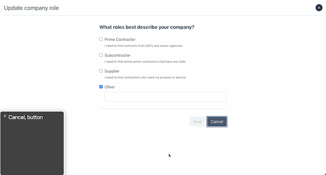
This is because the button is disabled programmatically using the attribute disabled. This is actually somewhat controversial. Because the button is fully disabled, I can’t focus on it, and so on my usual browse-through of the form with tab, I have no way of knowing it’s there. The context clue of this being a form with a “cancel” button makes it more obvious that the button must be hidden from me somehow, and I can work my way to it manually using VO+right arrow key.
💻 Developer notes: While this functions according to the official
disabledspec, this is a bit confusing for users. This is one of the cases where ARIA can improve on base functionality. If we removeddisabledand instead usedaria-disabledand some custom code, we could have a focusable (but prevented from submitting) button that informs the user it’s disabled.
If I do try to click this disabled button, I get an error message, which is immediately read aloud to me as it appears on the page.
After filling in that missing field, I’m then able to submit as usual and get another success message. Great! Onwards to the next workflow.
Open and investigate agency picker
This one, admittedly, I chose to demonstrate a specific issue that can be a little tricky to catch looking at the code on its own. I’m able to navigate to and open the agency picker easily, no problems there, so I check the headers (VO+U) to get my bearings.
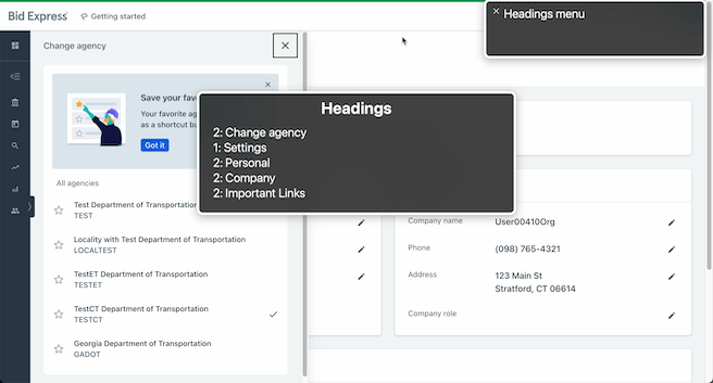
“Change agency” is listed as “Heading Level 2” which works as far as heading hierarchy, but it’s listed above the “Settings” level 1 heading. In addition, “Change agency” isn’t logically an action under “Account” (agency affects several different views), so it wouldn’t make sense even if the order of the headers in the DOM were swapped. This is why a “Bid Express” “Heading Level 1” would be handy; that way, both “Change agency” and “Account” could be “Heading Level 2” under Bid Express, without any of the logical hangups. Headings can be hard to keep track of across components across different files, so using the screen reader to check over them really comes in handy.
Create a bid request
Now I want to create a bid request. I navigate to the page no problem, as I’m growing familiar with the application and know “Secondary navigation” is where the “Bidding” tab will be.
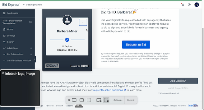
Before we proceed to create a bid request, note that the Infotech logo on the digital ID has an accessible label, “Infotech logo” (VO+right arrow key). For contrast, the blue checkmark a couple of lines above it isn’t labeled at all, and the screen reader’s cursor skips right over it. This is because it isn’t crucial information; although it shows that the digital ID is verified, just the existence of the digital ID without any “unverified” errors or notifiers is enough in this case.
After pressing space on the “Bid Request” button, we’re taken to a short form. The inputs are all labeled for the screen reader; no complaints here. There is some interesting behavior with the company field, though.
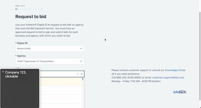
The screen reader correctly announced that the content within this auto-complete input had changed by reading the first option once it was available. This kind of content change is important to keep an eye out for. Had it not been announced immediately, I may not have realized what my options were at all. Some kind of announcement that the search has started may be appreciated due to the long search time, however, as well as an informational message informing the user of the minimum character requirement before the search is initiated. I knew that I had to type a few characters before the search would start, but a new user wouldn’t.
On attempting to select a company, I noticed another odd behavior. The space bar didn’t work to select an option; only the enter key. While this isn’t a major roadblock, listbox elements are expected to select on space, so this could be a moment of confusion for the user.
After I move onto the next page, I check the headings as usual, and while there is a “Heading Level 1” and several “Heading Level 3”, there is no “Heading Level 2”. This violates the hierarchical structure of the heading, so either the level 3 headings need to be bumped up, or a “Heading Level 2” needs to be added. Additionally, although the level 3 headers are visually emphasized, the document structure would more logically have their categories (“Digital ID”, “Agency”, “Company”) as headers. As it is, these headers are not truly headers of anything. In this case, it may be best to opt for a definition list and keep just the single level 1 heading on the page, or to swap the level 3 headings and their children.
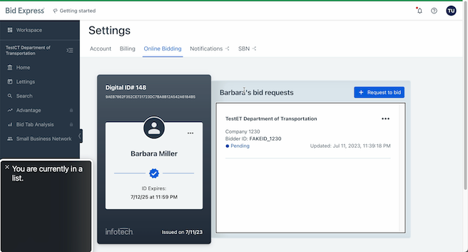
After wrapping up the bid request, I can check my digital ID for it. Everything looks good here. Take note: although it doesn’t have any bullet points, logically my bid requests are in a list, so the screen reader announces them as such. In the event I had several bid requests, this would also make it easy for me to tell just how many I have at a glance, while without the list element I would have to take my cursor through manually and count them.
Read users support data
Finally, let’s make a quick stop in the support panel to check how our tables are formatted.
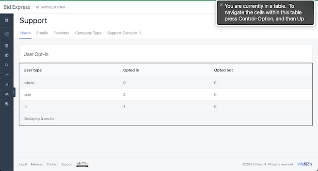
I’m told this is a table I’m entering when I move my cursor to it (VO+right arrow key), which is good. I don’t get a description of what the table is, however. While there is a heading “User Opt-In”, it’s not actually linked to the table programmatically, meaning that a user just investigating the table would lose that context. Regardless, I can now inspect the different cells more carefully by following VoiceOver’s automatic table instructions.
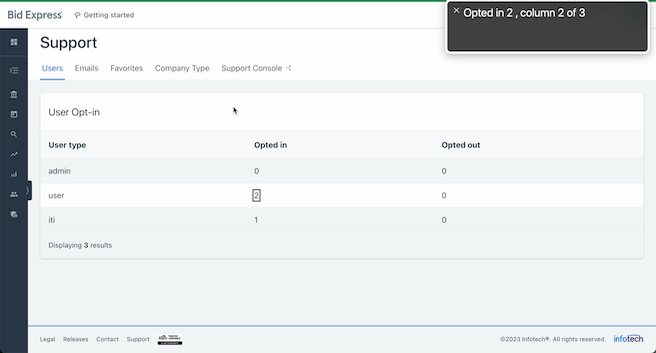
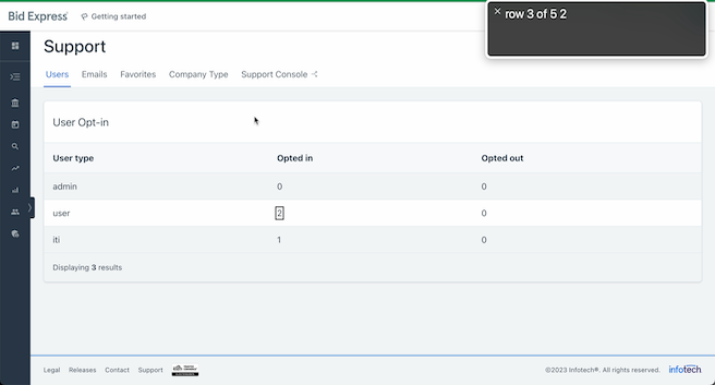
The columns and rows are all clearly labeled, but I quickly notice an issue; although I’m told when I switch between cells horizontally whether I’m in the “User Type”, “Opted In”, or “Opted Out” columns, I’m not told whether the current cell is the user type “iti”, “user”, or “admin” when I move vertically. Note that the second screen shot says “row 3 of 5 2” rather than “user 2, row 3 of 5” as it should. Although I can find what row this information belongs to by manually moving the cursor over to see the header name, this can be extremely cumbersome. In this case, the user types all need to be made table headers as well, even if they’re not styled as such.
The checklist(s)
Now that you’ve seen a real-life example of what screen reader testing can look like, it’s time to try it out yourself. There are two checklists below, intended to be completed in order for a comprehensive overview of a given web page. Only the second requires a screen reader to actually be active, but remember: keyboard accessibility is half of screen reader accessibility!
Keyboard accessibility
- [ ] Navigation
- [ ] All interactive elements are navigable by
taborarrow keyswithout mouse intervention - [ ] All focusable elements have a visual indication of current focus
- [ ] Focus order of interactive elements follows reading order or otherwise retains meaning
- [ ] All interactive elements are navigable by
- [ ] Interaction
- [ ] No significant action is triggered solely on focus
- [ ] All interactive elements can be activated with
space(button, various inputs) orenter(button, link) - [ ] All mouse functionality (i.e. hover effects) is possible with the keyboard alone
- [ ] Disruptive content that appears with keyboard focus is dismissible without changing focus (i.e
esc) - [ ] Modals and pop-ups shift focus to their content on open
- [ ] No page-specific keyboard events conflict with existing screen reader and browser keyboard shortcuts
Screen reader accessibility
- [ ] Navigation
- [ ] Page title is announced on entering the page and is unique and concise
- [ ] Page has a single “Heading Level 1” that is similar to the title
- [ ] Headings convey page structure and do not skip levels
- [ ] Headings are unique
- [ ] Header, navigation, footer, and other distinct sections of content are indicated as landmarks
- [ ] Multiples of landmarks have distinct labels
- [ ] Navigation is consistent and retains relative order across pages
- [ ] All content that is semantically a heading, landmark, link, table, and form control is recognized by the screen reader as such/appears in the relevant screen reader menu (accessed via
VO+Uand thenright/left arrow keyin VoiceOver) - [ ] Elements with the same functionality across pages are labeled consistently
- [ ] Reading order of the page as a whole is understandable, intuitive and follows visual order in most cases
- [ ] It is possible to reach the main content of the page quickly on page load
- [ ] Visual Content
- [ ] Elements that are functionally x are announced as x regardless of styling (i.e. lists, tables, links, buttons)
- [ ] Important text formatting is announced by the screen reader (i.e. quotations, emphasized text, strikethroughs)
- [ ] Relevant icons, images, and typographical symbols have a concise, meaningful description
- [ ] Purely decorative content is not announced or recognized by the screen reader
- [ ] Interactive Elements
- [ ] Content and label announced on focus is descriptive and understandable without context of surrounding text (though context may provide detail)
- [ ] Content announced on focus is not the same across different elements that do not share functionality
- [ ] Elements announced as “link” only navigate to another page or another location within the same page (and elements announced as “button” do not)
- [ ] Charts and other information-heavy visual content have a functional equivalent for screen readers (ex. table)
- [ ] Tables
- [ ] A caption is announced on entering the table if one exists on the page visually
- [ ] Both row and column headers are announced on each cell
- [ ] Row and column headers are all unique
- [ ] Nothing is announced as a table that is purely for visual layout
- [ ] Forms
- [ ] Form inputs announce a corresponding, meaningful label on focus
- [ ] Groups of form inputs announce both a meaningful group label and individual label on focus
- [ ] Expected type of input is announced on input focus
- [ ] Required fields are announced as such on focus
- [ ] Disabled fields are announced as such on focus
- [ ] Invalid fields are announced as such on focus
- [ ] Current value is announced on focus
- [ ] Any active errors associated with the input are announced on focus
- [ ] Required input formatting, value, and length information is announced on focus
- [ ] All instructional form text is announced by the screen reader for the relevant elements or element groups
- [ ] All form errors are announced on form submission
- [ ] Modals
- [ ] Modal is announced on its opening (i.e. first focusable element or custom label)
- [ ] Content Changes
- [ ] Page load is announced on completion if a custom loader is present
- [ ] Search and filter changes are announced on completion
- [ ] Urgent status changes are announced immediately or in a timely manner
Closing
Hopefully it’s clear by now that using screen readers can be extremely useful for fine-tuning the accessibility of our web application. We can read as much theory as we’d like, but sometimes a more hands-on approach is needed to reach the high level of accessibility (and general code quality) we strive for on the frontend team. As screen reader accessibility encompasses every facet of HTML, this guide could never capture every possible situation, but hopefully it’s provided a good overview nonetheless. Happy testing!
← Back to blog